Autocomplete
Overview
The autocomplete component is an enhanced text input that makes it easier to choose one or more values from a long list of options. The list of options is displayed when a user focuses the input.
Anatomy
Autocomplete is made up of a form input field, label, and overlay of menu options. The label is required but may be visually hidden. Optionally, a leading visual and/or clear button may be displayed.

Usage
Text input

The Autocomplete text input has all the same design functionality and properties as a regular text input including size options, width, leading visual, trailing action, and states. When a single item is selected from the menu, it will display in the input as regular text. If multiple items are selected, they will display as clearable tokens within the input.
Menu

The menu is a list of options for the field's value. It appears as a list in a non-modal dialog that the user may select one or more values from. The menu uses Overlay and ActionList designs for size, structure and interaction.
Menu item rendering
By default, menu items are rendered as a single line of text. The list in the menu is rendered using the Action List component, so menu items can be rendered with all of the same options as Action List items.

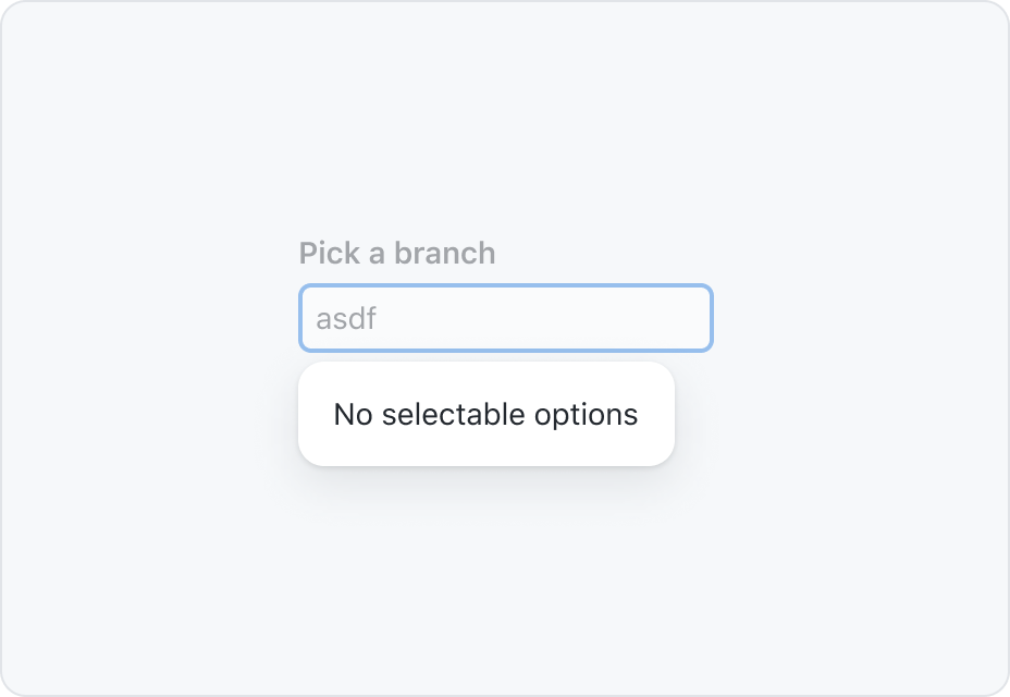
If no options are available based on the search term, the menu will display a message that says "No selectable options". A concise, custom message may be used in place of the default.

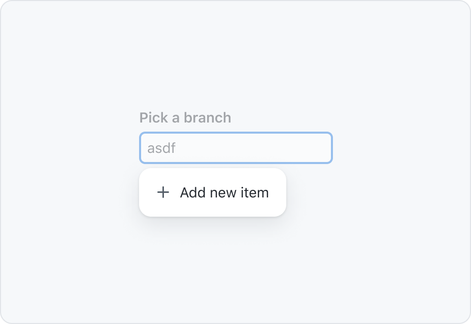
If a user is not limited to a pre-defined list of options, an additional item can be rendered in the menu to select the value that has been typed into the text input.

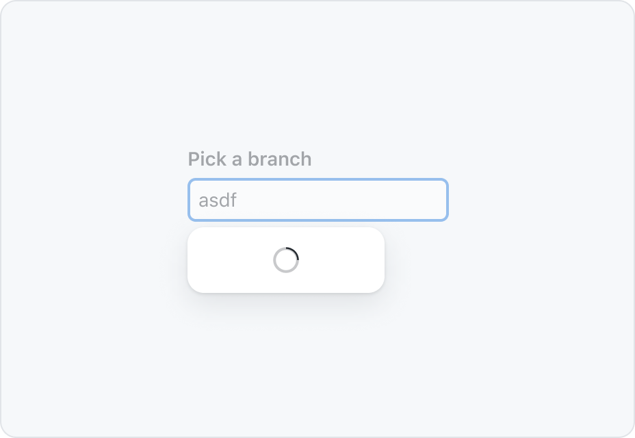
A loading indicator should be displayed while the data for the list of options is being populated. The loading indicator helps the user understand that the list is not empty, it's just not done loading.
Sort and filter behavior
Sorting
The order of the items should be ordered in a way that makes it easy for a user to find a specific value. This could mean items may be ranked by how likely a user is to pick that option (for example, ordering labels by the number of times they've been used in that repository), or it could simply be in alphabetical order.
If multiple values can be selected, the default behavior is to move the selected items to the top of the list after the menu is closed. If this sorting logic is not helpful for your use case, you may override this behavior with a more appropriate sorting logic.
Filtering
By default, menu items are filtered based on whether or not they match the value of the text input. The default filter is case-insensitive.
Custom filtering logic can be applied if the default filtering behavior does not make sense for your use case. However, it is strongly discouraged to disable filtering entirely.